|
(Title slide) I lightened and dulled the image so that it would have
greater contrast with the title. |
For class on Wednesday, I created a PowerPoint presentation following the format our professor posted. The format served as a type of outline which helped me and the other students to determine if we have enough information for our topics and to get an idea of where we are at in general. Our professor then gave us feedback and suggestions on what kind of changes we need in order to improve our research and write great essays.
We went over some basic techniques for making a presentation in class previously. Although the content is the most important past of any presentation, the appearance of slides can affect the ease with which the audience receives the information. Therefore, I tried to follow some important "principles of design," which include alignment, repetition, and contrast. I've included my slides in this post to point out some of the elements I included, but also because I am always open to constructive criticism. In addition, the slides show the basis of my argument and include some of my important research findings.
 |
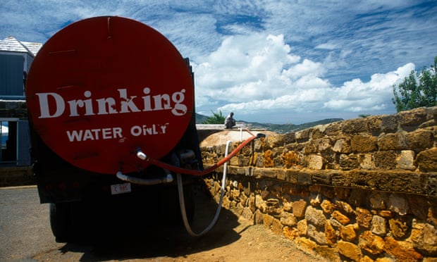
I included the picture in this slide because it shows an example of
the research I was finding that pushed me to focus on the negative,
instead of positive, impacts.
|
We had the choice to begin with either our research question or our thesis. I chose to use my research question, mostly because I have two main questions that are guiding my research. Not only am I looking for evidence to support my claim that organizations are ineffective in their efforts, but I am looking for solutions to help these organizations become more effective.
 |
I thought numbering would be more useful than bulleting for this slide.
Although my slides have more than 6 words per line as suggested by
some sources, the size of the font, color contrast, and easy-to-read font
make the slides look simple. I was also careful to not overwhelm the
viewers by including large masses of text.
|
I actually had four focal points in my original outline, but the instructions were to talk about three, so I cut the last one. However, now after thinking about it, I might instead separate my argument into two separate parts based on the research question they answer. I will have to make a permanent decision on how I will set up my paper relatively soon...
 |
For some reason in this format, I realize evidence for this focal
point is not as focused as I would like. Out of the context of the
paper I pulled this idea from, I feel like there may be a better
for me to phrase the point or maybe I just need to establish better
connections between the point and its evidence. |
 |
I used this picture because it is an example of an organization
advertising using words and images that would satisfy donors. |
 |
I will most likely use the map in this slide in my paper. It shows
the regions where PIH is established in Haiti. PIH is a great example
of a local organization that widely contributes to relief effort success. |
I tried to make the citations for the pictures the least distracting as possible. Also, I used a repetition of colors and font, both of which I really like.
 |
| This slide is straightforward... |
So that's my presentation! I think I did a good job of making it look neat and organized, and keeping it simple by including only my most basic ideas. Overall, I think it did help me to recognize potential problems before I begin drafting my paper. Hopefully I'll be able to organize my ideas better and find more research to make more connections.